User Interface
In this section, you’ll learn how to navigate the user interface effectively. The WebGUI is designed for optimal use on both mobile and desktop devices, with a focus on accessibility.
Main Window
Once you’ve logged in successfully, you’ll be presented with the main window:
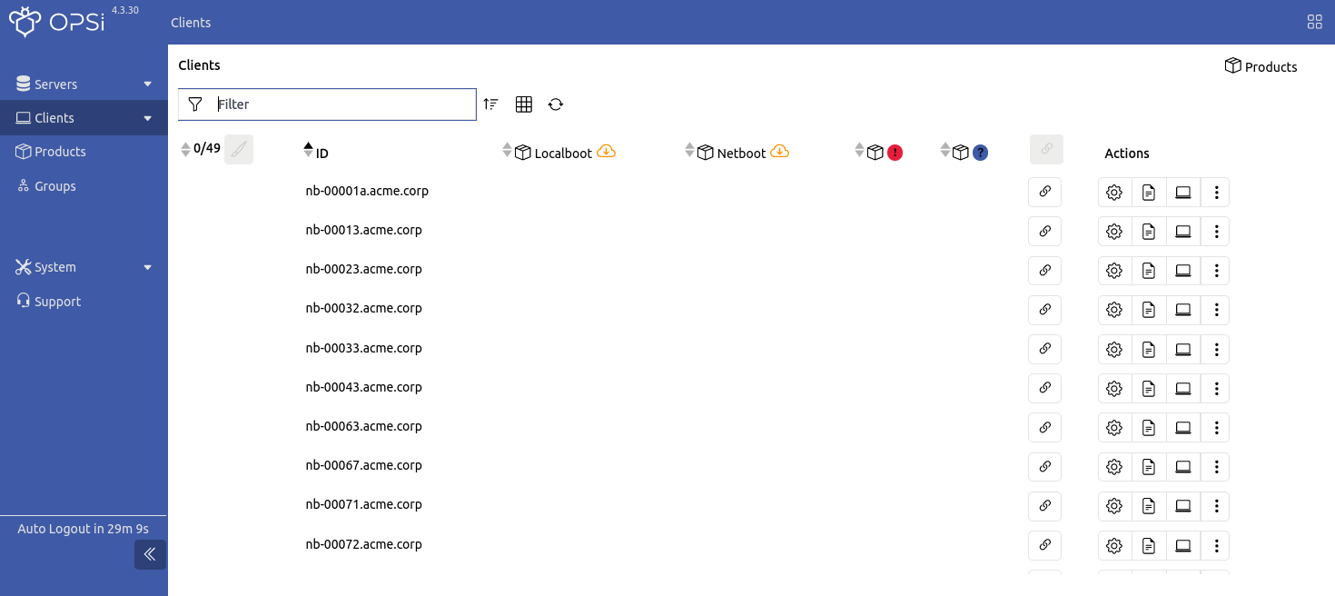
The top bar features a breadcrumb navigation that displays your current location within the application. Click on the button on the far right to open the Quick Panel. If you’ve disabled Quick Save in the settings, a button for saving changes will also appear next to the quick panel button (refer to chapter Settings).
Navigation Bar
The navigation bar on the left-hand side of the window allows for easy movement between different pages. At the bottom left, the remaining session time is displayed, after which you will be automatically logged out. You can collapse the navigation bar in the desktop view by using the button marked with two arrows (<<).
From the navigation bar, you can access the following sections:
-
Server
-
All servers: Management of the OPSI servers (config and depot servers)
-
Configuration: Editing the attributes and parameters of an OPSI server
-
-
Clients
-
All clients: Management of the OPSI clients
-
Creation: Creation of a new OPSI client
-
Configuration: Editing the attributes and parameters of an OPSI client
-
Logs: Displaying logfiles of the clients
-
-
Products: Provide products, check dependencies, or edit properties
-
Groups: An overview for editing the client/product groups
-
System:
-
Terminal: Opens a terminal/console to interact with a channel; by default, a terminal to the OPSI config server is available here.
-
Health Check: Checks various settings and versions of OPSI components and provides information on possible problems (see the section Health Check).
-
Admin: A collection of admin-specific tasks, such as blocking clients or locking products, as well as access to maintenance mode and backup settings
-
Modules: An overview of the activated OPSI extensions
-
-
Support: Displaying the OPSI documentation and further links
Quick Panel
The Quick Panel works like a quick navigation: It makes it easier to work with currently selected elements and to switch between servers, clients and products, regardless of which page you are currently on. This allows you to perform many actions quickly and efficiently.
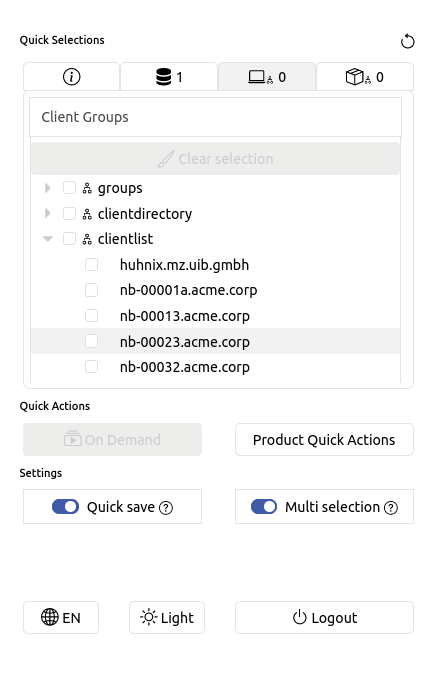
The Quick Selections section displays an editable list of all selectable options and tree components, enabling you to swiftly choose servers, clients, products, or groups. In the Quick Actions section, you’ll find client actions such as On Demand or Product Quick Actions. The Settings section allows you to adjust the application’s language and theme. Here, you can also toggle sliders to enable or disable quick saving and multi-select options.
| For more detailed information on configuring the WebGUI, refer to the chapter Settings. |
Main Area
In the middle you can see the server, client, product and group views. The client view is active by default. There is a header above the respective tables that you can use to change the view:
-
image::gui:webgui/opsi-webgui_table_filter.png[Filter] Filters the table contents by ID.
-
image::gui:webgui/opsi-webgui_table_columnselect.png[Columns, width=150]Shows or hides columns.
-
image::gui:webgui/opsi-webgui_table_sort.png[Sort, width=125] Sorts the columns in ascending or descending order.
-
image::gui:webgui/opsi-webgui_table_refresh.png[Refresh] Refreshes the table content.
The respective tables show elements that are reloaded with a delay when you scroll down or up. Use the image::gui:webgui/opsi-webgui_buttonclearselect.png[Clear selection] button to clear the selection for selected elements.
The Actions column shows the following three icons:
-
image::gui:webgui/opsi-webgui_buttonconfig.png[Configuration]: Shows the Configuration area.
-
image::gui:webgui/opsi-webgui_buttonlog.png[Logs]: Shows the logfiles on the right-hand side.
-
image::gui:webgui/opsi-webgui_buttonclientactions.png[Actions]: Opens a menu with further actions, such as Deploy Client Agent, Rename, Delete etc.
| You can access all options for selected elements and the entire table quickly through the context menu by right-clicking with your mouse. |
Navigation options are available below the tables in the footer.
| The layout for mobile devices differs slightly from the desktop version. For instance, instead of a split view for different pages (like configuration, logs, etc.), there is an overlapping view. |